Web coordinators text editor toolbar guide
"All we have to decide is what to do with the time that is given us."

— Gandalf
Hey all, welcome to your new website style guide and tip sheet. I'm your host, Matt Driffill, and on this page, we'll go over all the tools and styles we have in our new text editing toolbar. You'll see what we have to use, how we will use them, when we will use them, and why we will use them. Let's dive in!
That line above is our Horizontal Line tool, and it looks like this in the toolbar above (highlighted in screenshot):
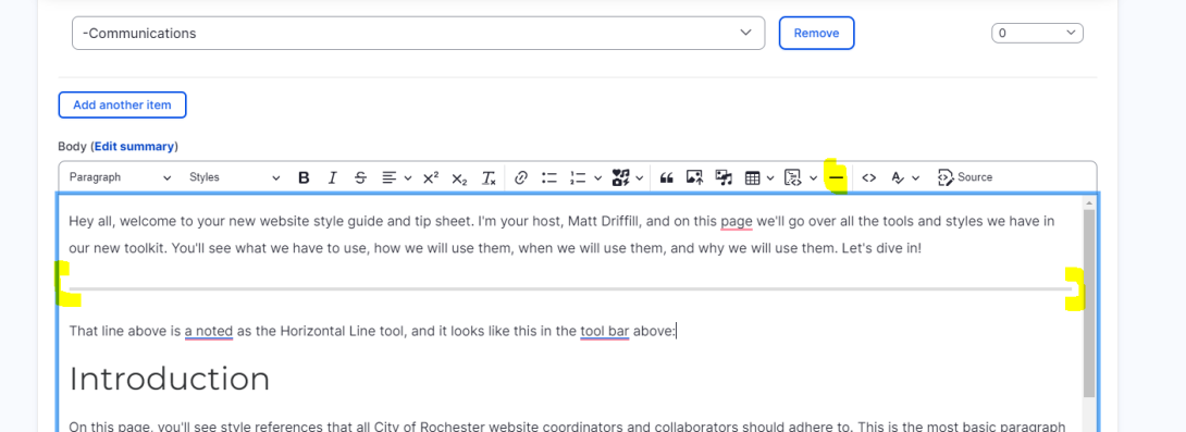
You may use that as a spacer in certain areas of the website, but for most cases, a simple line break and/or header will be enough to split up your content, so as we're starting off with it here in this example, remember to use this and most of the text enhancement features sparingly, lest we risk compromising their effects.
Also, that's a good indicator of how this guide will go, with screenshots and explanations. OK, let's keep going!
Introduction
On this page, you'll see style references that all City of Rochester website coordinators and collaborators should adhere to. This is the most basic paragraph font you're reading right now, stripped of all style settings. This is our bread and butter and should comprise the vast majority of text styles our constituents and colleagues will see on the website.
You'll notice the heading that says the introduction is a larger font size. This is our Heading 2 setting, which is the second largest after Heading 1. You won't be able to use Heading 1 anywhere in our WYSIWYG editor (pronounced "wizzywig," which is what the text editor tool is called). Heading 1 is reserved for page titles and landing page design concepts.
It's important to adhere to descending heading settings, as needed, on the page. Use Heading 2 to connect the top overarching themes on a content page, then Heading 3 for the next set of subject matter within that Heading 2 context, and then continue to descend further into headings as needed. We'll make note of these as we go throughout this guide. Also important to note: Headers should never be styled with bold, italic, or any other formatted settings. Please just strip these header settings when you encounter them in reformatting and review.
AP Style
The City of Rochester utilizes AP Style in all copywriting for the website. If you're not familiar with AP Style, here's a helpful reference to get you started (you'll notice that the text is hyperlinked. More on that in a bit. The Communications Bureau is responsible for ensuring AP Style is utilized, and we'll reserve the opportunity to edit the text as necessary on the site to adhere to this style.
I come from newsrooms where AP style was hammered into my head, so if you're in doubt about something, just shoot me a message on Teams. Alternatively, Google is a great resource for AP Style tips and rules. Check out this search result, for example:
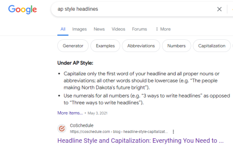
Wow, an image! We'll get to more on that in a bit, including how to insert them, how to arrange and resize them, and how to make them links if we need to. In general, making an image into a link is not the best practice, but for this example, I made the above screenshot into a clickable link. To do that simply:
Click on the image in the WYSIWYG editor, click on the link icon in the toolbar, and then insert your URL. Voilà!
Paragraphs & Font Formatting (H2)
Paragraphs (H3)
On our old website, there is often a tendency to compile as much information into a single paragraph as possible. And although we appreciate the finer details that make our city hum, we can be mindful to make our pages appear like a Dostoevsky novel (no offense, Brothers Karamazov). When you're going through migrated pages to reformat and edit, think about using line breaks as breathing room for our readers.
Even if a thought or piece of content from one sentence to another is connected, it's OK to space out the page with a new paragraph. According to AP Style, paragraphs should range from about three to five sentences (not a hard and fast rule, just a guideline).
Breaking out paragraphs is especially friendly for our mobile users, who make up about 66% of our total user traffic. So a good reminder when thinking about paragraphs: when in doubt, line break it out.
Font Formatting (h3)
You'll notice that the font was in bold. Allow me at this time to say we are getting away from the overused font settings COR web pages so often used in our last system. In Ektron, we were limited by what we could use to call attention to certain content pieces. We don't have to worry about that anymore and on this page, I'll show you how we'll move away from bold, italic, and/or other stylized fonts.
Links & Buttons
Links
Hyperlinking is perhaps the most important tool in the WYSIWYG editor toolbar because it creates and helps maintain the ecosystem that is this website, by cross-connecting pages throughout the site and directing users to the most intuitive corners of it. In this new system, we will be using two methods primarily for including hyperlinks on our pages. The first, and most commonly used method, will be standard URLs over text on content — like this.
Whenever there is language in a piece of content that could be hyperlinked to another spot on the website, it should be. We'll get to call to action links in a moment, and how and when to use them, but for this portion of linking, keep the website and the whole organization in mind with what can be linked.
To use a link, first, you'll want to copy the URL text that you want to insert. Then, when you find the text on the page you want to insert it into. Highlight that text, and then click the link icon in the toolbar. It looks like this:
If you don't like using the toolbar for everything (like myself), you can press CTL+K to activate the toolbar. Here's an example of when you might be using the linking in text on a piece of content:
Example: It was Friday morning on May 24, 2024, when Rochester Mayor Malik Evans signed a law that gave every City of Rochester employee their own house from the Buy the Block program.
Specific references to City of Rochester government functions most likely have a reference to link to on our site, so be mindful of that when editing and reformatting. It's also important to note that these internal links will help build our SEO with better metadata and crawling from Google. It's technically mumbo jumbo to say that when we use links when and where we're supposed to, it'll help all of our users get to where they want to go. If you're ever in doubt about something that should or shouldn't be linked, reach out to me, and I'll be happy to help, but I think for the most part, you all know what we're looking for here.
Buttons
Buttons are a fun new tool we have to play with! On Ektron we'd make ugly bold looking font things with text like "Click here to apply" or "Register here." Now whenever there is a call to action (CTA) for a user, we will be using button links instead. Inserting a button is a little different than the standard link over text we described above, but it's still pretty easy and it looks great. Here are the steps to using buttons:
First step is to write in the text you want to make into a button into the right spot in your WYSIWYG editor:
Example: This is going to be button text.
Once you have your button text, highlight it and make into a normal link as described above.
Example: This is going to be button text.
Now that you have your link in the text, you can apply button styles. While still highlighted, mouse up to the "styles" dropdown in the toolbar:
Similar to the heading, these go in order of how we want to use them. By default, always use the primary button option. That looks like this:
Example: This is going to be button text.
Doesn't that look great! These buttons should be used whenever there is a call to action. Reminder: For basic pages, which is all you will be editing and working on at this point, only needs primary button link styles.
Images
To insert an image in the WYSIWYG editor, mouse to where you want the image to go, and then click the "insert media" icon in the toolbar, which looks like a musical note over an image, like this:
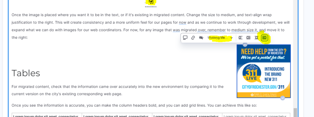
Once the image is placed where you want it to be in the text, or if it's existing in migrated content. Change the size to medium, and text-align wrap justification to the right. This will create consistency and a more uniform feel for our pages for now and as we continue to work through development, we will expand what we can do with images for our web coordinators. For now, for any image that was migrated over, remember to medium size it, and move it to the right:
Tables
For migrated content, check that the information came over accurately into the new environment by comparing it to the current version on the city's existing corresponding web page.
| Lorem ipsum dolor sit amet, consectetur adipiscing elit. P | Lorem ipsum dolor sit amet, consectetur adipiscing elit. P | Lorem ipsum dolor sit amet, consectetur adipiscing elit. P | Lorem ipsum dolor sit amet, consectetur adipiscing elit. P |
| Lorem ipsum dolor sit amet, consectetur adipiscing elit. P | Lorem ipsum dolor sit amet, consectetur adipiscing elit. P | Lorem ipsum dolor sit amet, consectetur adipiscing elit. P | Lorem ipsum dolor sit amet, consectetur adipiscing elit. P |
| Lorem ipsum dolor sit amet, consectetur adipiscing elit. P | Lorem ipsum dolor sit amet, consectetur adipiscing elit. P | Lorem ipsum dolor sit amet, consectetur adipiscing elit. P | Lorem ipsum dolor sit amet, consectetur adipiscing elit. P |
| Lorem ipsum dolor sit amet, consectetur adipiscing elit. P | Lorem ipsum dolor sit amet, consectetur adipiscing elit. P | Lorem ipsum dolor sit amet, consectetur adipiscing elit. P | Lorem ipsum dolor sit amet, consectetur adipiscing elit. P |
Once you see the information is accurate, you can make the column headers bold, and you can add grid lines. You can achieve this like so:
Click the table icon in the toolbar and select the cell dimensions you want vertically and horizontally.
Image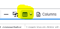
- Insert your content into the table.
- Highlight the text in header columns and make it bold.
To add the gridlines, you will use styles like we did for buttons. When you click on a table in the CMS, a black border will appear around it and then there will be a little square button in the top left corner of the table. If you click that square, the table border will turn blue.
Image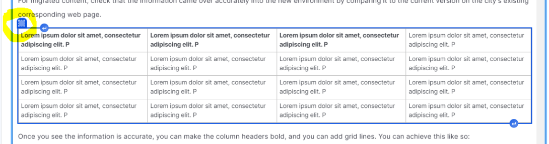
- Once the table is blue, you can click the styles dropdown menu in the toolbar and scroll down to the table section. There you will find options for different table appearances, but for migrated content, just choose the style that says border.
Embeds
I don't expect all of you to be able or interested in inserting embed codes and I'm able to assist with these, but for those who are able or interested, below is the code you may user for iframe inserts (how we do GIS, surveys, forms, and many other multimedia functions):
<iframe src="insert_URL_HERE" width="100%" height="600px" frameborder="0"></iframe>
Note that the embed may appear more thin in the WYSIWYG text editor view, but it's set to 100% so it's responsive width for desktop, mobile, and tablet. We also may need to extend the height for certain dashboards, but the code above should work for most of our iframe embeds.
For other embeds that aren't iFrame, like Google Maps, you can use a similar source code from that project to place. For things like YouTube Videos, please use the media library's remote video option to embed.
If you're having trouble with embedding, or need help, please reach out to me!
Spellchecker
Our CMS has a CKE editor spell-check tool built into it, and it's a robust spellchecker that will help us correct typos and mistakes in text. Try typing in a misspelled word and see how the checker works. Shouldn't be too much.
All that said: We highly, highly, highly recommend you install the Grammarly browser extension. It'll be a secondary safety valve for our quality assurance, but will also help you as a universal spelling and grammar check for you no matter what website you are using. It's a free tool and it works great.
Click here to download Grammarly for Chrome
Document & PDF uploads/inserts into pages
- 1) Upload the document to the media library
- 2) Place the text in the editor where you want the document to go
- 3) Highlight the text
- 4) Add hyperlink (CTLR+K or use the toolbar icon)
- 5) Search for the name of the document to insert in the search window that appears for the link insert.
- 6) Change the now-hyperlinked text to primary button style from the WYSIWYG (wizzywig) text editor toolbar.
Conclusion
That's it for now! Check back often as we'll continue to build out this guide as more development occurs, but this should be more than enough to get started on the new site content cleanup of which we're currently embarking. As always, never hesitate to reach out to myself or Brenda if you have any questions to need any help.